BTC · Bybit futures · liveBybit liquidation heatmap
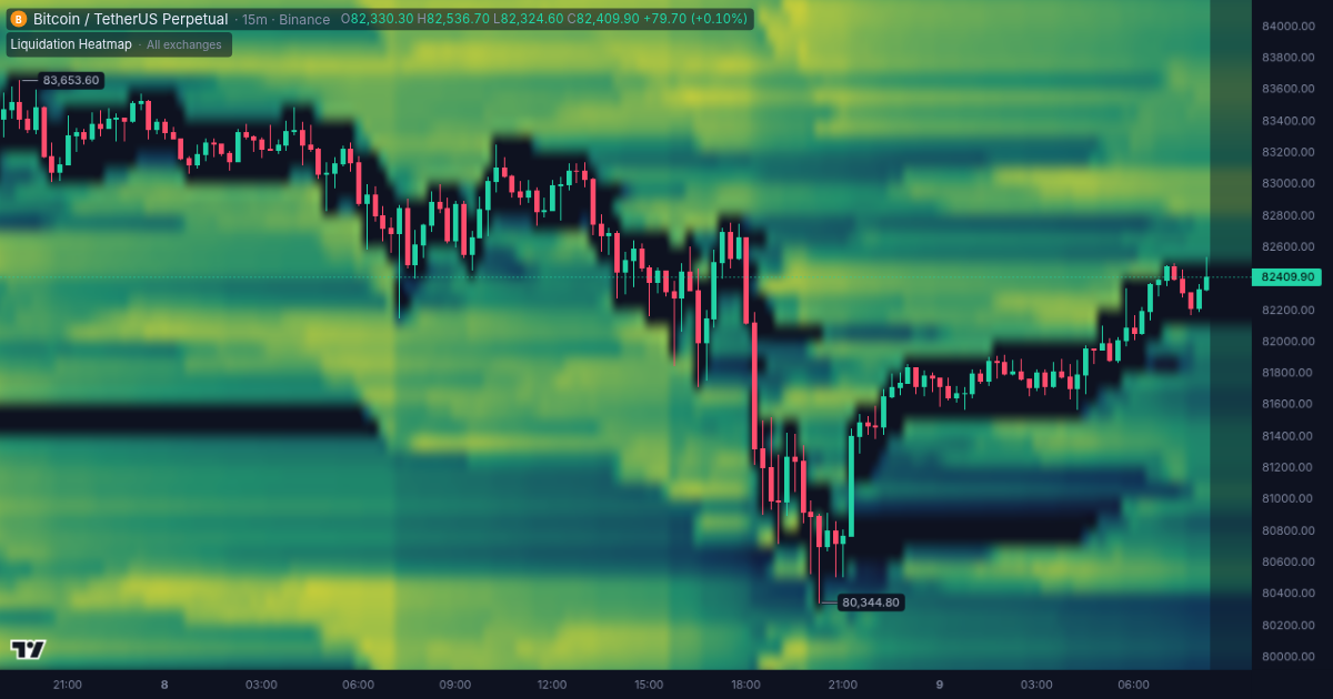
The Bybit liquidation heatmap shows the prices where leveraged BTC longs and shorts on Bybit futures get liquidated, level by level — in real time, free and without sign-up. The brighter the band, the more money stands there; two days of history show which clusters the price has already taken.
On the Bybit liquidation heatmap, as of 19:12, November 2, 2026 UTC BTC trades at 77,004. Within 2% below the price stand $1.6M of long liquidations. Within 2% above the price stand $10.1M of short liquidations. The largest level within 5% below the price is $943K at 74,300, within 5% above — $6.0M at 80,100.
BTC liquidation levels on Bybit now
The map is free. A free account adds what stands behind it: alerts on these levels, stop orders and take-profits on the same map, whales and the owners of walls, deeper history and trading from the chart.Free forever — this is not a trial. Sign-up takes a minute, no card required.
Largest BTC liquidation clusters on Bybit
| Level | Amount | From price |
|---|---|---|
| Short liquidations above the price | ||
| 80,700 | $4.7M | +4.9% |
| 80,500 | $3.5M | +4.6% |
| 80,100 | $6.0M | +4.1% |
| 79,100 | $4.0M | +2.8% |
| 78,500 | $3.5M | +2.0% |
| Long liquidations below the price | ||
| 76,600 | $561K | −0.5% |
| 75,900 | $630K | −1.4% |
| 75,800 | $236K | −1.5% |
| 74,300 | $943K | −3.4% |
| 74,200 | $421K | −3.6% |
With a free account
- Alerts when the price comes to a level — to the phone, Telegram or email
- Stop orders and take-profits of Hyperliquid on the same map
- Whales and the owners of walls: who stands at the level
- History deeper than two days
- Trading from the chart on your exchange account
What the map shows
- Liquidation levelsThe prices where leveraged longs and shorts are force-closed, with the dollar amount at every level.
- Two days of historyHow each cluster grew and which ones the price has already taken.
- Levels right nowThe latest snapshot as bars by price: what stands below the price and what stands above it.
- Largest clustersThe biggest levels on both sides of the price with their amounts.
The same map on the BTC chart
In the terminal the map lies over the price chart next to the other indicators: you see how each cluster was built and what the price did when it came there.
Open the BTC chart
Questions and answers
What does the Bybit liquidation heatmap show?
The price levels where leveraged BTC longs and shorts on Bybit futures are force-closed. The brighter the band, the more money stands at the level; long liquidations are below the price, short liquidations above it.
How do I read the Bybit liquidation heatmap?
Time runs left to right and price bottom to top. A bright band is a price level where many leveraged positions get force-closed; when the price reaches the band, it takes the cluster and the band ends.
How is it different from the BTC liquidation heatmap of all exchanges?
This page shows Bybit alone. The BTC liquidation heatmap page adds up Binance and other exchanges, and the BTC liquidation map by exchange shows the share of each exchange in a level as bars.
Which exchanges have their own liquidation heatmap?
Binance, Bybit and OKX, each for Bitcoin, Ethereum and Solana. Other coins are on the common liquidation heatmaps; Hyperliquid has its own liquidation map.
How often is the Bybit liquidation heatmap updated?
Every few minutes. The heatmap keeps the last two days.
How much does the Bybit liquidation heatmap cost?
Nothing: the heatmap is free and opens without sign-up. A free account — also at no cost and with no time limit — adds alerts on these levels and the chart in the terminal. Paid plans start at $29 a month.